Tuesday, October 29, 2013

VIP Club @ SZXC

We recently have been commissioned to design an extension to our office project in Shenzhen SZXC in form of a VIP Club with Wine Bar and Tea area. The project will go into construction early next year. 

The project is sought to be a meeting place for clients beyond the office atmosphere, a more casual lounge for the after business meetings. The project will complete the program of the office as an holistic operational environment - even beyond the working hours.


Team: Ulrich Kirchhoff, Louise Low, Claudia Wigger, Isabella Ducoli, Eugenio Fontan, Jorge Gil Suarez, Satoshi Yamada

© 2013, ice - ideas for contemporary environments

Construction Log SYH

We love construction sites! Last time we went to site, the basement was excavated and the pile heads done. Two months later we are seeing the ground floor covered, just before winter will halt construction.

The project is our winning entry for a 90,000 sqm luxury hotel in Shenyang, featuring the one of the larges free spanning ballrooms in China. We are part of a larger consortium (larger means also larger problems, not necessarily better solutions), responsible for the partial design of the architecture, all facades as well as all interiors. The bumpy road gets rewarded by such site visits where you see beside the massive construction problems also the immense large scale of the project - and our ideas becoming real. 

The first picture is the overview of the entire ground, second picture is taken inside the main hotel core. And the third picture is taken from the drop off looking into the lobby area.

If nothing goes wrong, the superstructure will be up to the top floor (25 floors) by middle of next year. The facade should be finished before the end of 2014. And opening will be in 2015.


Team: Ulrich Kirchhoff, Louise Low, Claudia Wigger, Jorge Benetirez, Matteo Biasiolo, Celine Clivaz, Agnieszka Drankowska, Isabella Ducoli, Eugenio Fontan, Sevan Spiess,  Jorge Gil Suarez, Satoshi Yamada, Yue Zhang

© 2013, ice - ideas for contemporary environments

Monday, September 2, 2013

Deep Blue: Top 9 Outdoor Swimming Pools

After the sad closure of the Victoria Park outdoor swimming pool, which we have written about in our last post, we decided to look for our most favorable outdoor pools. Please find below our top 9 in random order:

Alvaro Siza, Leca
Beautiful seafront pool that makes use of the natural topographical formation. Rocks are embedded into the pool design. On different platforms, you have a stunning view over the Atlantic Ocean. The pool is fed by seawater only. Some pools are so close to the shore that they are a natural wave pool.


Peter Zumtor, Vals
Serene and Zen, the minimal design enhances the peace and tranquility of the pool. Similar to Siza, natural elements and materials play a vital role to the pool and its atmosphere. 


Pichler+Traubman, Private Pool
Although the pool is very small, it features with the singular operation of a sliced and folded plane a huge variety of functions. From water slide to beach slope to underground elements. The pool picks up the language of the landscape as a topographical change.


MVRDV, Sloterpark
Never built, the pool design makes use of the quality of the section of a pool and makes it the generator for the entire building.


Moshe Saftie, Marina Bay Sands Sky Park
The proportions of the entire development went very off compared to the commission proposal. Yet, being located above Singapore, the pool is a fine example of what spectacular sight an endless pool can allow for. It is clearly one of the most interesting sightseeing tower experiences, I ever had.


Plot, Copenhagen Harbour Bath
Fed by seawater, the pool is framing the nature through topographical transformation of the wooden deck. The pool is built into the river and has a strong presence of the city around it. The beauty of the pool lies in the multi functionality of the wooden deck, which can server as a sunning deck as well as a springboard.

Paschke+Milhonic, Zollverein Essen
Built into the centre of the world heritage site at the Zollverein Essen, the pool was planned as an art installation to re inhabit the Zollverein. The contrast to the surrounding creates surreal and magical moments.


Eco Pool
One of the most beautiful swimming experiences I had beyond ocean and lake, was in an eco pool. Spatially very interesting as it blends the garden pond with the functional pool. The importance is that the ratio between heavy planted shallow water (for cleaning and filtering) and the pool itself is at balance. It also takes time to create an equilibrium to the pool. But after that, water quality is unbeatable.

Pamukkale
Pamukkale in Turkey is not man made. It is a natural formation of ponds and puddles. Maybe the most imaginative and design oriented swimming experience - if only it would have been invented by man.


All images have been downloaded from the internet, we do not claim authorship over those images.

© 2013, ice - ideas for contemporary environments

Tribute to Victoria Park Swimming Pool

Summer is coming to an end. So is the life of the Victoria Park Outdoor Swimming Pool. It closed its gates yesterday at 10 pm for the last time.


Being a passionate swimmer myself, I am deeply saddened by the closure of this wonderful urban experience. For the past few years I have spent my daily morning swim in that pool. The best moments were at the beginning of the outdoor swimming season when water was freezing cold and only me and 10 lifeguards were around in the chilling morning sun. My children learned swimming in the pool. I was with them from the time of their first clumsy approaches in the water to the moment they glide naturally through the deep blue.


Nights at the pool where startling. The pool lied at the edge of Victoria Park, surrounded by the city that formed a formidable background to the scene. The moment the sun set, buildings began to sparkle. First as a reflection of the setting sun, then as a powerful skyline of artificial lights. Whoever knows Hong Kong, knows the seduction of its skyline at night: the fascination of the behemoth of urban invention and innovation.


And in the middle of the city was this giant pool (during hot summers a rather overheated jacuzzi) from where you could enjoy the beauty of the skyline. It always was a magical and surreal moment, floating in the water and watch the city passing by, day as night alike.

To me, the swimming pool and the already demolished Kai Tak airport were some of the few formidable metropolitan sights of Hong Kong. They were proofs of the intense effects and collisions of a hyper dense city. But they also demonstrated that you could be at peace within this moloch of a city; it showed that the collision and confrontation can create urban poetry at its best.

Opened in 1957, the pool has been one of the oldest outdoor pools of Hong Kong, one of the few with a 5m diving pool and a 50 m lap pool with a 10 m dive board. It also features a grand stand for public viewing and a restaurant with pool view. The beauty of the pool lies in its design of the boundaries to the surrounding park. The park landscape was seamlessly translating into the water landscape. Changing rooms were placed under the grand stand to reduce the architectural impact of the pool.


To my dissatisfaction, the newly constructed indoor pool next door is a large scale architectural mass, with no relation to the context. The design has not benefitted from the subtleness of the outdoor pool, nor from the function of a park as an urban open area for the public. An alien like, disproportionate podium block was designed, which rather resembles a shopping mall than a public swimming pool for leisure and enjoyment. It is understood that an indoor pool is a building, an outdoor pool is a landscape: However a six story disproportionate glass blob which seals off its interior from the surrounding park is a rather cynical answer towards a positive transformation of the city.

It is a shame as the city of Hong Kong missed the chance (again) to encourage excellency for its public buildings. Instead, they apply commercial and economic logic to their civic construction as well and neglect the social, spatial and historical components that have made Hong Kong what it is in the first place.


Luckily swimming requires a certain functionality. So I will find myself at peace with the new venue as long as it features a clean 50 m pool and enough space to swim.

However there must be a reason that the pool was one of the most beloved leisure venues of the citizens. During my last swim at 10 pm, there were a lot of people inside the pool. Most enjoyed the last opportunity to dive in a 5 m deep 50 m olympic size pool. In fact the bottom at 5 m was the most crowded as there will be no pool anymore of this depth. There was a large crowd at the stand, taking pictures of the great view, chatting with the lifeguards and silently but happily and enjoying the scene. Most likely some of them contemplated wether the new pool will be as enriching to the city as the old one.

When we left the pool as one of the last, we left with the certainty that Hong Kong has sacrificed another urban jewel of its glorious past to the genericness of the commercial world.

© 2013, ice - ideas for contemporary environments

Sunday, July 7, 2013

Spatial or Social Preservation? - West Wing, Hong Kong

Preservation is a delicate issue in a city like Hong Kong, which is reinventing itself in a rather frequent cycle, creating radical paradigm shifts every 20-30 years. In that process of restructuring the city, the West Wing and Government Hill came under threat of demolition: A colonial, governmental cluster, built over the period of British rule over Hong Kong. With the Hong Kong Advisory Board closing this latest outrage of the public on this process of destruction and reinvention by granting the Grade I status of a monument, an uneasy silence fell over the debate on what to do with that premise in the future.


I always liked that building as it one of the few buildings in the city that embraces the fact that it sits on a steep slope (most of them tend to ignore the topography and just create a new flat ground). The West Wing is offering multiple levels of entries and acts as a sectional device at the foot of the mountain that becomes the Peak. On the points of interface between mountain and building, there were a few public anchor points, that are specifically highlighted architectural and volumetric: A retaining wall that extends into the ground lobby and a cantilevered box in the middle of the building, that acted as a canteen and event space. It is not necessarily a mind blowing building, but a modest proposal for a modern post war architecture.

Most importantly however is the fact, that the building hits Queen's Road Central at its front end, the most central of all Hong Kong roads, forming the spine of the CBD of the city. Its back end leads into an extensive green zone that contains the zoo, Hong Kong Park and eventually leads towards the Peak and its nature reserves around. The urbanism is fascinating around the building. City on one, nature on the other side. The West Wing is the wedge between the two. Unfortunately it is a hostile one as it is programmatically detached from both.


As usual in the debate about preservation in Hong Kong, it is not the architectural value that makes the building worth it, but the social condition it created and are now considered part of the collective memory. In case of the West Wing it was the public consultation counter (the first of its kind in a governmental building) and the cantilevered box that was hosting parties for young people once in a while. It made the building a very public space in the eyes of the people. It nearly introduced participative opportunities for the community. I guess this memory is growing stronger every day especially as the current government lacks the will to offer participation for the public. Neither is it willing to create opportunities for young people or emerging entrepreneurship.


When we were approached to do a proposal for the West Wing, we were wondering how we can enhance social conditions spatially. And how can we then make those spatial potentials social again. We wanted to transform the building, yet preserve its functional status as a public incubator inside a governmental compound.


Our proposal was a most simple one: We introduced an escalator that connects the lower urban fabric with the mid-level of the building that contains the cantilevered box as well as an upper plaza. Connecting the public spaces inside and outside the building by an external circulatory system manifests the social and public value of the building and allows to open the building for more civic functions (in fact as it used to be).


Unfortunately the building will be given back to the government and the legislative counsel which will make it highly unlikely to be open to public ever again. Being a security fortress now, the building will finally be a very hostile one to the urban fabric. The question remains if a demolition of the building would have not been more beneficial in the end as it would have introduced commercial spaces as well as civic functions to the site. Even more unfortunate at this point is that the initiative which was fighting for the remain of the West Wing is silent since the building is preserved. And this although the West Wing is even more demolished and stripped of its social function at this point.

Although spatial preservation is guaranteed, the building lacks its socially relevant dimension by converting it to a state of privateness and disclosure.


In regards to the debate whether or not West Wing deserves a Grade I Preservation status, our Louise Low has presented an article to the public to the debate in April:

 A Modest Proposal


A casual urban wanderer through the verdant hillside along Battery Path, behind the HSBC tower, may look up and wonder about the curious building perched at the top - its facade has not been usurped by giant billboards, display merchandise do not crowd its windows, its structure is unadorned by LED lights. In the midst of the shimmering edifices driven by commercial and economic impulses, it silently advertises itself as a concrete anomaly in the vortex of heavy traffic, a fort against the flux of alluring goods and money.
The staid West Wing, together with the Central and East Wing, is part of the conglomerate of former Central Government Offices (CGO) in an area marked as “Government Hill.” 
Plotted at a fengshui-blessed axis to the Government House and the Court of Final Appeal, it housed the body of the Civil Service workhorse tasked with the straight forward mandate of safeguarding the interests of Hong Kong and its people. The psyche geography of the triumvirate as guardian is etched in the undulating topography of Government Hill.
Built in the 1950s, the CGO’s abandonment of the florid, conservative neo-classical colonial tradition and embrace of post-war Modernism paved the way for Hong Kong's first steps towards an image of the City as reflected by the "International Style" movement, harbinger of new social and political ideals. The symbols of state power and class structure gave way to a more global and egalitarian aesthetic.
Spartan minimalism and structural exposure spoke of an honesty, integrity and openness, of a more idealistic era when "government" seemed closer to the ordinary lives of people as mirrored in its modest, streamlined architecture.

Meticulous documentation in defense of its essence can be found in a sensitive publication by CUHK, “The Greatest Form has No Shape” and on the website “http://www.governmenthill.org/”, with embedded videos of significant emotional impact - an interview with the former Director of public Works, Michael Wright, describing the assiduous search for iron-free granite from Diamond Hill, as well as a silent film of the construction crew, both men and women, hewing stoically, shaping the land’s destiny with the same tenacity and fierce determination of those used to “eating bitter” - scornful of obstacles, unfazed under the blistering heat of mid-summer.

These will likely be all that is left of the history and collective societal memory embodied in these structures should current government plans to sell and redevelop the much coveted site forge ahead.

While the announcement of intent tiptoes nervously around talk of more profit accruing to government coffers, the debate hinges on the relative “lack of architectural merits” of the buildings. Some find them “ugly.”

Indeed, they are “ugly” among the diamond-cut designer towers in Central the way a well-worn white cotton shirt is “ugly” next to highly embellished, lavish designer fashion.

Grim, austere, dour, astringent, stern, stark...a monastery whose architecture conveyed the clarity of purpose, that of chaste, dedicated service.

The aesthetic of simplicity and humility is understandably anathema to the current vogue for flashier architecture. It evokes a nostalgia of a different Hong Kong society. It offers a provocative contrast, and a rebuke to excesses. 

As night follows day, the pendulum inevitably swings. 
The economy of the past decade, inebriated on free-flowing liquidity and bubbly real estate, sprouted fantastical, mega-budget, iconoclastic architecture of an irrational exuberance in important cities all over the world. The precipitous fall of the ill-fated $1.2billion Millennium Dome of London and the Experience Music Project of Seattle from feted trophies to mocked effigies come to mind. 

As bubbles burst and the hangover sets in, have our eyes made the necessary, timely adjustment in the cold light of day to judge with dry lucidity an architecture from a more sober age while under the lingering influence of the taste for intoxicating monumental follies?

From the perspective of preservation, does aesthetics even matter? Styles emerge from the history of a society, and the imperative of history is to record and narrate past truths, to capture their meaning for the unfolding present and future.

Buildings are not preserved based on market worth, maintenance costs or beauty but on the merits of their social meaning, singularity, urban memory and historic relevance.

Examples of preserved modernity include Tel Aviv’s “White City” which was awarded Unesco World Heritage status in 2003. In recognition of the need, the World Monument Fund launched “Modernism at Risk”, an advocacy and conservation program for Modern buildings in 2006. (see http://www.wmf.org/advocacy/modernism)

It is no surprise, then, that a government which now prides itself on its business acumen should offer up more bargains. After all, Hong Kong is the proverbial shopper’s paradise, the erasure of its history and a lobotomized memory is but a small price to pay for fattened public coffers. 

As what’s good for big business is good for Hong Kong, an unlimited Plot Ratio and GFA should be offered to the highest bidding developers who may jointly build, market and sell as much as they may possibly wring out of the site. Whom but the most endowed, wealthy and powerful elite in Hong Kong deserve the right to move into Government Hill? 

Finally, this symbolic demolition of the last frontier between the public and the private will no doubt be an event as celebrated in Hong Kong as the Fall of the Berlin Wall. To maximize proceeds, the government could auction the buildings piece by piece on eBay to serial sentimentalists or enterprising opportunists who flip them for even greater gains. It is not that the remnants of these buildings and what they once represent should not be consigned to the dustheap of history, but why should every last stone not be parlayed into payoff?


Team: Ulrich Kirchhoff, Louise Low, Claudia Wigger, Matteo Biasiolo, Celine Clivaz, Jorge Gil Suarez, Sevan Spiess

© 2013, ice - ideas for contemporary environments

Tuesday, May 21, 2013

The Frauded Architect - Great New Project in Qatar

Too good to be true - a warning for the architect in general:

We have been approached via email by a company (Bapeqs Group) from Qatar, which asked us if we are interested in designing a shopping mall in Qatar. It sounded like a great opportunity: USD 60,000,000 budget for 12,500 sqm, sustainable design approach with targeted green certification. Of course we were interested.

Yet we were concern how they got to know us as you don't do multimillion dollar business with somebody you don't know at all. For sure Qatar is booming, far away from us and they do have a lot of architectural practices in the region. Our repeated question on how they came about to contact was finally answered with: Our CEO instructed us to contact you after his last trip to China.

It was suspicicious that no connection could be made to anybody we know. Too good to be true. However we stupidly caught us already thinking about some sketch design ideas and talking to an environmental consultant who had a branch office in Doha as well. It is the stupidity of the architect that makes him do these irrational moves. It must be the urge to create that overrides logic and reason. 

We were asked to submit a brief office CV and introduction and they told us they scheduled a meeting among the board of directors to discuss, which architect to select for the project. Eventually they selected us as the appointed architect and issued a formal letter stating their choice.

Around that time a befriended architect, who is exclusively doing non-commercial small scale work with no commercial experience whatsoever, asked me if I had experience in working in Qatar. He received this email about a shopping mall design. He was getting rather excited about it, yet tried to maintain a face of skepticism, but was very keen to believe it could be true. I surely realized that moment how blinded I have been for the moment: my ego was pleased when somebody wants to work with you. I felt reassured that my work is great and globally relevant if somebody contacts you from the far outer regions of the planet. What a dumb and puny nature is the common architect (such as myself).

However, with the new information of unlikely coincidence, I was getting curious on how this would end and why would somebody do this? What's the catch? Our environmental engineer told us to hope for the best but prepare for the worst.

I received an email by the client to invite us to Qatar with up to 5 people. They informed us that Qatar has strict requirements for architects. Every company that wants to work in Qatar has to register with the AARCQ first. The registration comes with a price tag of USD 2,100, wired via Western Union. So here was the catch.

Luckily I am a stingy person so I contacted the client that he should bear the costs of the registration, upon which he replied that they spoke to the AARCQ, which passed the responsibility of fee payment to the architect only. 

Luckily I was cured mentally enough already to decided to play that game a bit longer for at least gaining some entertainment and laughter from the incident. I contacted the AARCQ myself and ask them for advise on how to deal with the registration fee and this is their reply:

"Thanks for contacting us. The Architect's Accreditation Registration Council of Qatar represents the architectural profession in Qatar. It is engaged in producing an extensive series of practice, management and law reports on matters related to architectural practices and building in Qatar generally. One of its main functions is to initiate, define and assist in the implementation of program and co-operation in the development of architectural education, practice and research in Qatar. It is mandatory for an international company to register with  AARCQ  to proceed a project in Qatar. For your registration  follow the link below for the registration form
http://aarcq.org/registration_form.htm
It is your duty as an Architect to obtain this we do not allow client to do this because may client hide under their architects to register  draftsman AARCQ international Verification officer to Asia  is in United Kingdom , this will help make the Verification faster with help of the international verification officer we will be enable to issue the certificate within 7 working days.
Please note that all international registration payment is through western union money transfer, it is written on the form. The complete address and the name of the verification officer that will pick up the funds on our behalf  is below , make the payment  in favor of the person stated below.
Name:- James Morris
Address:- 17 vibreville Street, London 8 DE, United Kingdom
You can call him now on+447012929027 
I hope to hear from you , thanks for contacting us."

I was wondering after such an email, if anybody would ever be so naive to pay as a foreign firm to an address in London on behalf of a government body of Qatar for a project in the Middle East? Apparently and sadly there are such cases. An Internet research shows that this fraud has been ongoing for a few months now (NL-Architects also wrote about this in their blog): 

http://nlarchitects.wordpress.com/2011/10/25/dream-assignment…-or-419/

I contacted the so called client again and asked them to bear the fee while we do the submission. He returned with the following email:

"If you can not handle this  we can not do another thing. Did for we pay for your school fees for you to become and architect why is this so hard  for you. For us  to continue you have to do it yourself"

I finally returned his email with the following self-satisfactory answer:

"I contacted the AARCQ already and they gave me a recipient address in London to pay the registration fee to:
Name:- James Morris
Address:- 17 vibreville Street, London 8 DE, United Kingdom
As they don't seem to care who pays the fees, please kindly transfer the USD 2,100 on our behalf to the person in London. Send us the western union slip and we will do the submission of the documents."

To conclude:

I was surprised by the professionalism of the fraud and want to take the chance to warn other architects about this. 

These people really put an effort in with creating websites and hold up a conversation for quite some time. At first glance everything looks slightly plausible. 

I think they do understand us architects rather well: vain to the bone, in desperate need for recognition, blindfolded to fraud due to the immense competition in our profession worldwide and the need to grasp any opportunity that occurs. Already we do competitions for free, so why not pay a registration fee for a project. We willingly give away freebies and undermine our competence as a business. So why not doing a fraud that targets the naivity of the profession as a whole? Luckily we got away with a good laugh. I hope that this post helps others to not fall into this trap.

PS: This was our final email to the "client", concluding our conversation. Obviously there was no answer ever again:


Hi Mubarak bin Ali,

Thanks for your email. 

I tried to contact the AARCQ again to waive the fee for us as money cannot be transferred to a foreign account on behalf a government body. 

As it says on their website that the AARCQ is a statutory board under the ministry of works and housing, I have taken the liberty to contact the ministry of interior of Qatar to verify the payment procedure. It turned out that there is no such ministry of works and housing or the AARCQ. 

I am afraid to inform you that you have been scammed by some filthy individuals who want to fraud honorable clients such as yourself. 

Luckily nobody has been harmed financially up to now. As there is also no need to register our company in Qatar according to the ministry of interior, we can go ahead with the project for now. We are looking forward for a successful collaboration. 

Please book the tickets for 4 of our staff as well as accommodation. As the flight is longer than 4 hours, international business practice requires business class for the directors (in our case 2 people). As we need to understand the local conditions better, we would suggest to stay for a total of 4 days. 

Please let me know what information you need to book the flights. 

Thanks

Monday, March 18, 2013

Construction Log March: SZXC - Completed


With more than a year delayed due to us unknown circumstances...

...finally one construction site less.


Concept Model for Lighting Concept


Planning Concept


Lift Lobby


Main Corridor


Reception


Reception Counter


Lobby Lounge


Lobby Lounge


Floor Plan


Company Logo


Conference Room


Conference Table


CEO Reception


CEO Office


CEO Table


CEO Table Detail


Female Toilet


Male Toilet Washbasin


Male Toilet Washbasin with Mirror


Male Toilet Cubicles


Manager Room


Meeting Room


Corridor


Second Reception


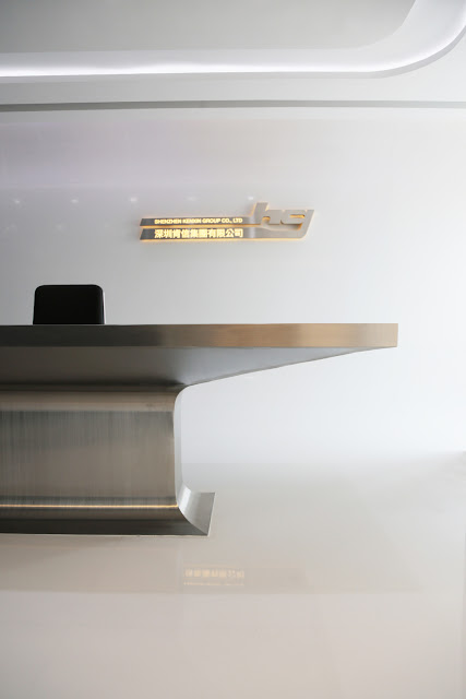
The design is an office interior for a commodities and finance trading company, based in Shenzhen and Hong Kong. For their corporate headquarter in Shenzhen, we were asked to design the project for a cellular office organization within a high-profile building in a prime area of the city.

Located in a central core office, the floor is separated in units for lease and a main office which houses two sub companies of the corporate holding. With two entrances on the other side of the core and 20 over office and meeting rooms, the orientation within the space is rather confusing. 

We designed the project by putting the main focus on ceiling and floorplan as an enhancement and representation of the circulation system. The ceiling is guided by light troughs which lead to publicly accessible rooms. The floor is a direct reflection of the ceiling with rough and glossy surfaces. 

To differentiate the two entrances to the office, the character of the finishes transforms from metallic to organic, from corian, aluminium and glass to wood and leather.

Team: Ulrich Kirchhoff, Louise Low, Claudia Wigger, Matteo Biasiolo, Celine Clivaz, Jorge Gil Suarez, Juliana Kei, Sandy Lee, Olgierd Nitka, Sevan Spiess, Lien Thanh Gruetzmacher, Jacky Yp

© 2013, ice - ideas for contemporary environments